In the first part of the article we talked about how to be organized communication home and garden, zoning site, what is “multilevel” and how it can be created, as well as why the fence can not be discounted landscape design. Now let’s move on to the form, color and composition.
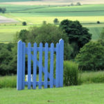
Error 5. Passion for geometry
Since the landscape design suggests a repetition of motives, many gardeners consider it this way: once the plot is rectangular (as a rule, it happens), then all the lines of the layout should be smooth: paths –straight, lawn – square and so on.
However, in professional design for the layout of the site as a whole, there is a completely different rule, which is called “the opposite method”. The method is to create a sharp contrast, when the existing shape and size of the site as if “denied”.
So, if the plot is narrow and long, to correct these shortcomings will not direct layout, and angular, diagonal or rounded, arc. Well, the choice between these options is already carried out in accordance with the style of the garden:
- if the desired design requires an object of the correct shape, then let it be not a square, but a diamond and so on. We need to distort the shape, to make the eyes move slowly, following the lines instead of rectangular recreation area to make the corner, the track is plotted on the diagonal and so on;
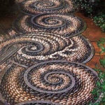
- if you like the landscape layout, choose rounded lines: winding paths, recreation areas round, oval or irregular wavy shape. Even if, for whatever reason, to make infinity track absolutely impossible, come to the aid of faux: just arrange during the track grounds, interesting transitions. Well, if the paving material will be heterogeneous. Yes, if the plot is too small, it happens that there is literally nowhere to make a winding path. But this can also be overcome: create the illusion of a winding path, making parts of the straight from different materials. Naturally, the combination of materials should not be carried out in a staggered manner. To create the impression of curvature, you need a “fantasy” pattern of paving.

Well, if the material of the tracks will be heterogeneous
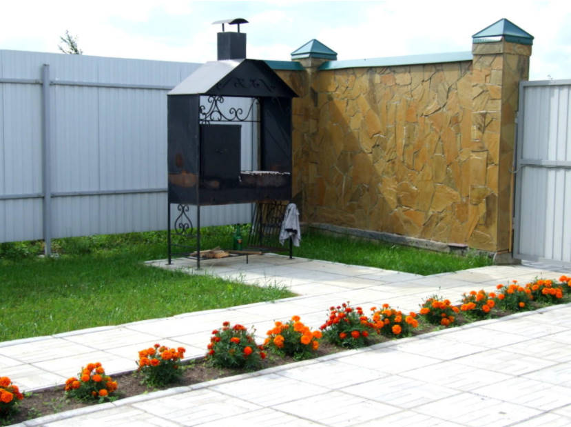
All of the above applies to flower beds, and to individual large plants (such plants – an element of “sculpture” in the garden), to water bodies, to lawns. For example, the front lawn is best to make a rounded, arc – shaped or ribbon-shaped, and if you like-and free, arbitrarily curved. It is also necessary to have separate objects not in a straight path. Thus, the area visually sharp corners are rounded and widen narrow passages.

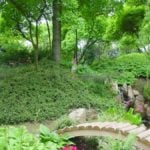
The landscape is better
This technique, unlike the method of this kind, suggests that when choosing garden accessories, you will also adhere to the trend of contrast. It should be noted that the way the opposite there are no trifles. If necessary, it can be used locally: if, for example, you have some uncomfortable areas on the site (with sharp corners or narrowed).
Error 6. On the site there is no composition
The word composition is heard by many, as well as the fact that in the garden, this is the song necessarily should be. But this topic is so extensive that design students, for example, study it for 5 years. The composition is not symmetry, not the selection of only about one color scheme, not necessarily the classic style in the garden. Composition is the science of how to properly position objects to make it look beautiful. The composition should be in the garden as a whole, and in each of its individual elements.

There is no composition here
I must say that the feeling of composition inherent in many people instinctively, they just do not realize how they use it. For example, the ability to dress stylishly, to combine garments is also a composition.
In order for the garden to have a composition, it must have a center, “the main character”, around which there are various objects and plants. The center is something very catchy that it is impossible not to pay attention. This something can be anything. But, of course, the object must be large enough: the structure, structure, group of plants and so on.

It is very important to choose the right center of the composition
The center of the composition is called an active dominant. It is understandable: after all, it should stand out, catch the eye with some catchy quality: form, texture, color, originality of design, bright stylistic affiliation, uniqueness, author’s idea.
The centre code name, not necessarily to look for him in the middle of the plot. It can be located anywhere in the garden, and sometimes even beyond its perimeter. And he’s usually the one, many centers do not exist.
And the composition is a proportionality, that is, the size of the individual elements of the garden to each other and the size of the house the size of the entire site. If the elements of the garden do not correspond to each other, it cuts the eye and looks as if everything is collected from different sites. We need to balance the dimensions. How can this be done?
- first, proper planning. The big house – a significant environment: the gazebo and recreation area should be spacious, and the trees high. Accordingly, the site should also be extensive. Well, if the house is small, then, for example, the gazebo should not argue with him in size;
- secondly, there are special techniques. Here, for example, what if a small area already built a big house? Then the environment also needs to be made “big”, with the help of landscape design techniques to visually increase the size of the garden.

And here is here fallacy of composition there is
And most importantly, the composition identifies a specific distance. Usually the objects have where it is necessary or guided by practical considerations. And it does not always look harmonious, even if the objects are exceptionally beautiful.
Everything in the garden has its own “technical” specifics. Approximately-it is unprofessional. So, if you are considering a separate object, then you need to know not only how, but also at what specific distance from each other (in meters, centimeters) will be located its individual parts.
The same question arises when you need to add a new element to an existing composition. Where is it? The answer to this question will give the criterion of the Golden section. The Golden section is a special proportion, which is even called “divine”. All works of art contain it. The Golden section is quite difficult to define, just like this:”this is the division of the segment into two unequal parts in such a proportion, where less refers to more as well as more to the sum of its parts.”
In practice it is simple: in a garden it is necessary to apply conversion factor, it is equal to 0.618. Let’s say you have two objects, the distance between which is 10 meters You need between them to place a third object. Question-where? Absolutely in a certain place. Multiply the distance between objects by a factor of 0. 618, get 6.18 m. Hence, the third object should be placed at a distance of 6.18 m from any of the two available.
Error 7. Wrong color used
Very common, as any garden – multicolor, it’s not a city apartment. Here play the role of design, and, of course, plants. The mistake is to assume that in nature any combination of colors is beautiful, and the more shades, especially bright, the better. That’s not so. In the garden, you should always strive to use harmonious color combinations that happen:
- in the form of nuanced harmony, when the design of the garden uses different shades of the same color;
in the form of tonal harmony, when various, but similar colors are used; - in the form of contrast harmony – when using opposite, sharply contrasting colors.

In the garden, you should always strive to use harmonious color combinations
Any of the harmonies can be in the form of a dyad (two colors are combined), a triad (three colors are combined), or quarts (four colors are combined). So, you see, the combination of more than 4 colors or shades at the same time in one composition will not be too harmonious.
Do not forget about the group of neutral colors:
- light grey;
- light bluish gray;
- beige;
- sand;
- cream;
- very light yellow.
They will be a great addition to bright and juicy colors, balance all too catchy. So it is good to use in any of the harmonies, if any, the principle of combining colors. Of course, the neutral will not instead of, but in addition to the basic colors, which participate in the combination.

The color is clearly too much
On the landscape, our perception of color is somewhat different than indoors, because outdoors there is sunlight, or “yellow component” (even if cloudy). Eyes in this light without distortion sees only the bright, warm shades. But the cold tones are distorted and”fade”. Therefore, if you want to plant flowers in a Sunny place, it is better to choose those that bloom in red-yellow-orange range. And in the penumbra to place plants, flowering blue.
Garden lighting is constantly changing throughout the day. Therefore, it is important to see how a particular color looks in different lighting. All unsaturated colors should be used as a background, and saturated-to be accents.
All of the above applies not only to plants! And the color of garden structures also need to be selected harmoniously. Here, of course, the layman will be difficult. And here’s what I suggest. In order to accurately choose the colors of the garden, it is best to make a legal collage. Just in it and there are images that make the choice of colors perfect. The garden uses a large amount of materials and plants, and any mistake will cost literally expensive. Here is how I suggest to do it:
- On a large sheet of paper, you need to stick a few large enough photos of the main corners of your garden, and next to these photos, apply different samples of paints for buildings, roof samples, facings, pieces of paving materials (you can just clear them), photos of the desired plants, furniture and accessories of exactly the color as you want. Naturally, given the basic rules of color combinations. Do this until you find the option of color combinations to suit your needs.
- Now it can be fixed (paste components) and take out this collage on the street, to consider at different illumination at different time of day. If you like the result, then this collage becomes a guide to action – a model for specific purchases.

This color is from nuanced harmony
Be careful with colorful accessories! They are made of artificial materials, so the bright color on them increases and “suppresses” the colors of nature. In any case, it is better to give preference to pastel tones.
To be continued.
Related posts:
 How to Create a Rose Garden. Planting Options and Selection of Roses
 Best Options for Gazebos. Types of Structures, Use in Landscape Design
 The Mirror in the Garden
 Pruning Shrubs
 The three Most Popular Mistakes that Gardeners Make
 The Most Beautiful Sculptures for the Garden
 Paths in Your Garden
 Top 10 Trends in Gardening
 How to Visually Enlarge the Area: Methods of Landscape Design
 The Chinese Garden: History, Philosophy and Types of Gardens
 Landscape Design of a Small Area: Pushing the Boundaries
 Seven Significant Attributes of the Japanese-Style Garden
 German Garden: History, Features and Development Options (Part 1)
German Garden: History, Features and Development Options (Part 2)
German Garden: History, Features and Development Options (Part 1)
German Garden: History, Features and Development Options (Part 2)
 TOP 10 Design Ideas of Garden Paths
 Roof Garden: a New Wave of Landscaping Captures the City