In the last article (How to Visually Enlarge the Area: Methods of Landscape Design) we introduced you to the methods that allow you to push the boundaries of the site, without moving the fence, but only competently using landscape techniques and visual effects. There were three ways: color, perspective and reflection. Today we continue this interesting topic.
Method four: relief
Do not be surprised, but even the relief has an impact on the perception of the garden in various sizes. I think it is not necessary to prove to anyone: standing in a pit ten meters deep or on a hill of the same height, a person experiences a completely different feeling — in the case of a pit area seems significantly smaller. The same goes for your precinct.
Of course, to raise the level of the garden is an expensive idea, but if it rises above the neighboring areas at least 20-30 centimeters, it already looks more than it actually is. And more neighboring plots, which in reality have the same size.
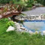
By the way, this rule applies not only to the site as a whole, but also its individual parts. So, if the pond has steep slopes, it will seem smaller, and if flat – more (with the same area of the water mirror). Do not forget that dense high fences along the perimeter work in the same way as the slopes of a deep pit, and from the point of visual perception do not differ from them.
Method five: the environment
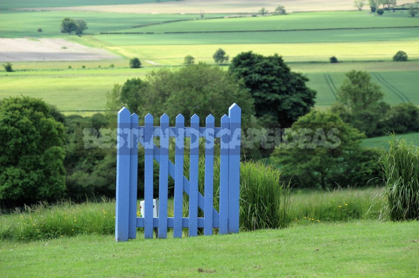
We continue to talk about the relief. The fact remains that the site is on hills it seems more because we are beginning to see the countryside. In classical landscape architecture in General, the inclusion of surrounding species in the landscape is very important. If we see a distance from the site, we automatically add these spaces to our territory, thereby subconsciously increasing it.
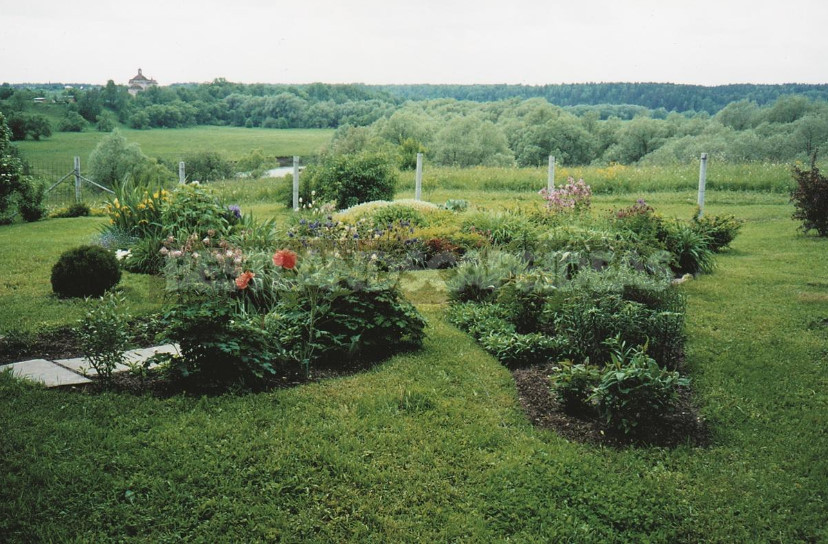
As for the environment, I would like to say about the restriction — the fence or its alternative replacement (for example, trimmed hedges). If it is a monotonous wall with constant height and width along the entire length, then such a perimeter solution creates a feeling as if you are in a box. As soon as the height of the hedge begins to change, or she becomes more diverse, or changing its width, the garden immediately becomes more interesting and seems somewhat larger than it actually is.
If it is a fence, then it can be beaten by changing its width and its height (plants, of course, some of which may be higher than it, part below, part can be planted almost close to it, and part strongly issued forward). This will also help to push the boundaries of the garden.
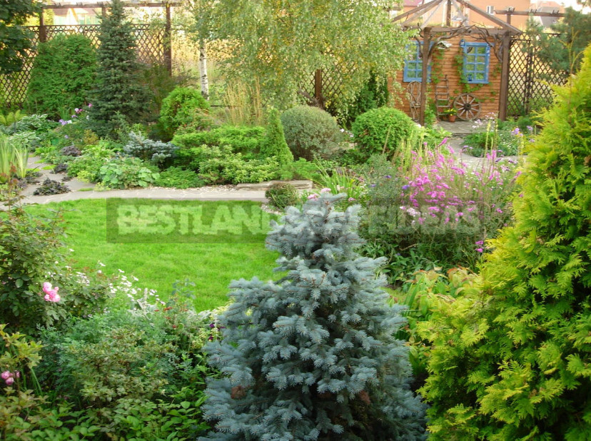
And finally – about the forms used. Have you ever been in a narrow corridor, where the walls are glued Wallpaper with a pattern of vertical stripes? If you had to, you probably remember your feelings: the already narrow corridor seems even closer and at the same time higher. A person feels as if he is at the bottom of a tall beer glass.
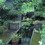
The same thing happens in the garden: if on the sides of a small rectangular area suddenly appear cypress-like vertical or even just slender trimmed hedges, it becomes even narrower and even more elongated.
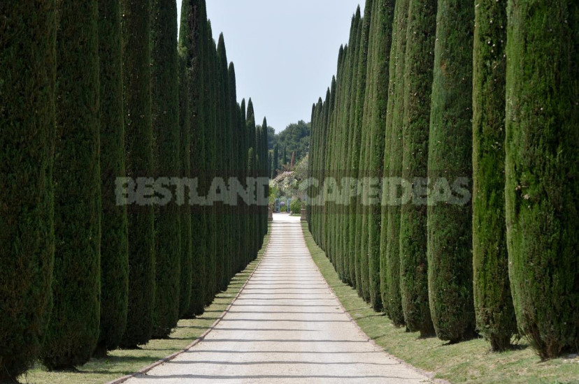
Imagine a path on which vertical varieties of arborvitae are planted, and a path of the same size, but it is planted with low semi-growing shrubs. In the first case, the track will seem narrower, in the second it is perceived almost in its size. If the color also interferes with it — and we talked about it last time-and the columns suddenly become dark, and the semi-growing shrubs will be covered with white flowers, then the sensations will increase noticeably. Keep this in mind.
Method six: angle of view
There are horizontal and vertical angles of view. In the case of visual changes in the space of the garden for us is particularly important horizontal angle. Without going into the subtleties of the features of visual perception, we can only say that the average person has this angle of 28 degrees.
This means that if you put a person on a bench in front of a long flower garden, he will see only part of it. This part will be exactly the one that falls into the named corner. It is in our power to build a composition that would fall entirely into this corner or one that would not fall. Depends on what?
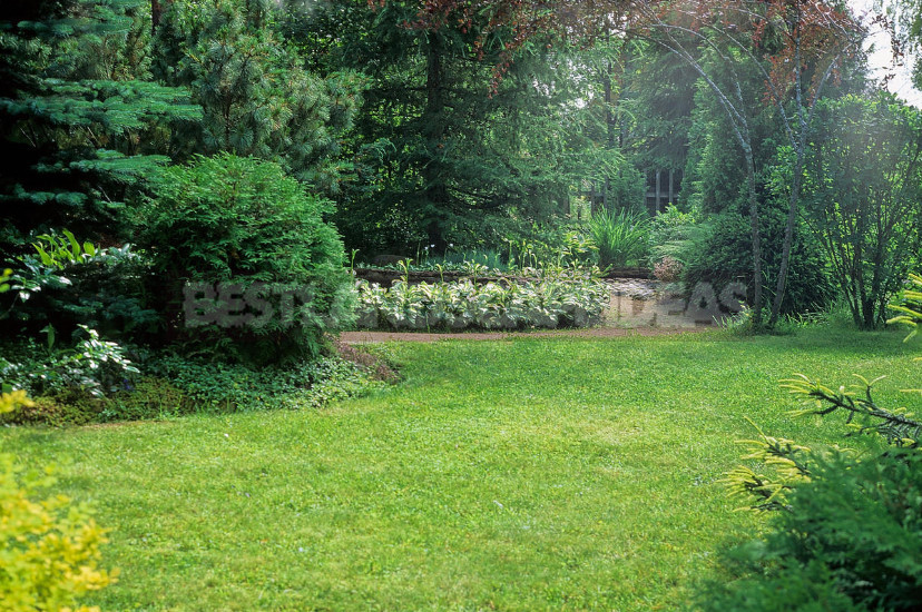
If we want to show the isolation and self — sufficiency of any composition (for example, a sculptural group), then we must show it entirely and immediately, that is-to fit it all in the horizontal and vertical angles of view. If we want to show the infinity of any element, on the contrary, it should not fall entirely into this corner-it is necessary that it at least a little, at least some of its edge went beyond its borders.
It is very strange to see how large-scale in our understanding of the elements: lawn, water mirror and so on — suddenly fit into one corner. Their area is read as a whole, and they are literally scraps. But it is worth the same elements only slightly go beyond the corner, as their area visually seems larger than it actually is.
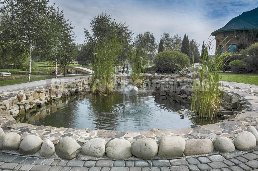
As soon as a person in order to see the whole picture, is forced to turn his head at least slightly, the size of the element he immediately seems larger than they really are. But times seem to be large elements of the garden, and the garden itself also seems great.
Method seven: structure
Have you ever noticed how to move aside the wall of the room, when it lay a round carpet or put a round table for family dinners? Circle, indeed, an amazing figure, which has a number of advantages. But now we are primarily interested in the fact that the circle significantly expands the space around it. Especially clearly this happens if it is light.
And if such a circle (lawn, paving, water with a reflecting sky, and so on) exists in the garden, the space of the garden expands. A square or a rectangle, especially if its sides are parallel to the boundaries of the site, too these same boundaries emphasizes. All too clear, and therefore slightly boring.
It is necessary to destroy this parallelism-and the garden becomes quite different. It opens up a lot more opportunities in its design, which means that the garden becomes more interesting. In this case, its area is visually increased, as the visitor in this case there is some loss of orientation in space. This is especially important in all sorts of narrow places — for example, between the wall of the house and the fence. Using there circles (or balls) will expand the space.
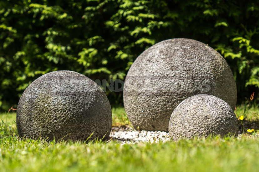
What it will be in reality: plants, paving pattern, forged elements with winding lines, water devices, sculpture – – you decide. By the way, in order not to make such places even narrower, when designing it is necessary to use lines parallel to the short side, and minimally parallel to the long side.
On the other hand, expanding the narrow spaces of the garden, do not forget that it is very easy to negate the already existing vast open spaces. The plane of the lawn, pond, and so on can seriously decrease if they suddenly accidentally appear foreign inclusions (Islands or bridges on the water, groups or flower beds on the lawn…). And the situation is more tragic, the closer this element is to the geometric center of the open space.
Just do not think that we discourage you from placing such items. We just want to say that this should be treated very carefully, because if, expanding the site in one place, we so mediocre reduce it in another, it will be a waste of labor, a waste of time and effort.
Well, in conclusion I want to say about the most important thing. Thank God that now there are fewer people who need to prove that in addition to the physical, there is an emotional component of the garden. And without the latter, a good garden is unthinkable. Do not be surprised that this characteristic directly affects the “big” garden we have or not.
Garden, readable at a glance, where everything is clear, everything is clear, observed the laws of proportion and color, yet will be empty, not filled, and therefore – small. More spacious will be the one where every turn opens up more and more pieces, albeit smaller in area, but each with its own mystery, with its own mood.
