Sooner or later we understand: to collect beautiful plants in the garden is half the battle, you need to put picturesque pictures out of them. After all, even the most exquisite flower on a particular “canvas” may be out of place if it destroys the coloristic harmony. So, it’s time to learn the alphabet of colors in order to transform suburban possessions.
What will it be like, your renovated garden? With painted details of multicolored flowerbeds or restrained-monotonous, as if superimposed on the canvas with large strokes? Color is perhaps the most controversial and complex element of landscape composition, because the imperfect shape of the crown of a tree or the boring line of the path is not so obvious to the eye.
Color solutions pacify and soothe, delight and delight, cause boredom or irritation, depending on whether we like or dislike the result. Therefore, the choice of the color palette of the garden and the compatibility of colors should be approached seriously. And we usually take this task lightly, focusing solely on our taste and not consulting anyone, although we do not consider it shameful to consult with professionals with questions about why roses do not bloom or how to arrange drainage. And as a result … Blue rhapsody Myosotis can accidentally blow up tulips, and brick-red Tagetes will try to infiltrate a flower bed with pink and crimson white-striped Petunia.
How to understand that the combination of colors is flawed?
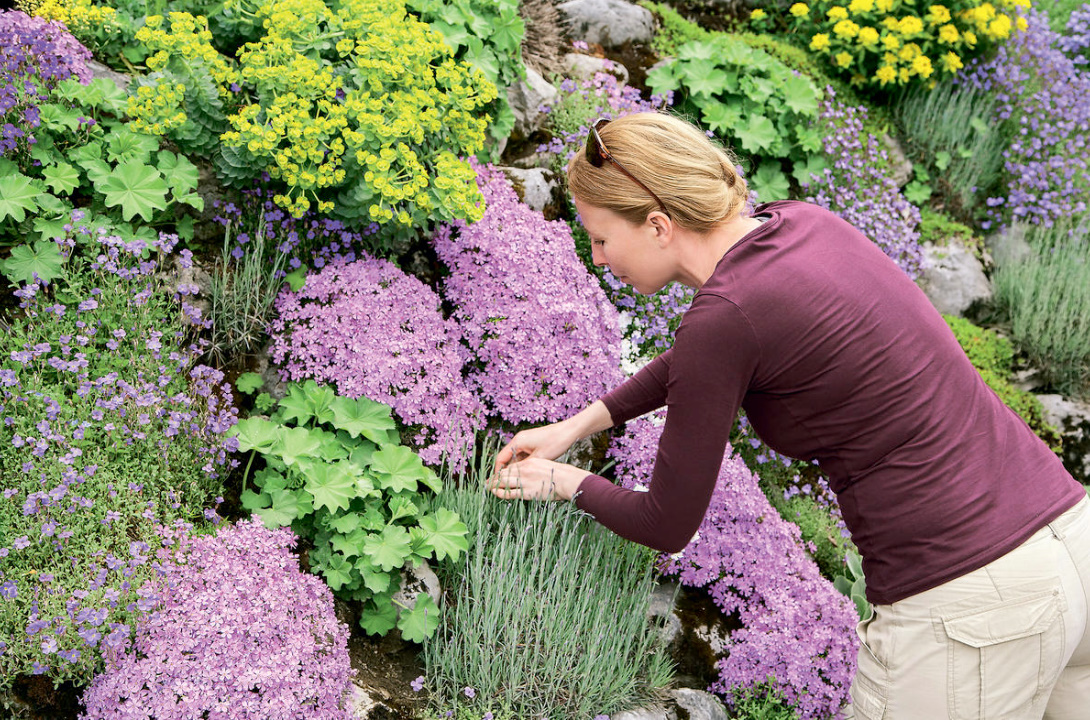
At the everyday level, this is not difficult, trust your feelings: if it seems to you that the red tulip got to the Myosotis by accident, then there is something wrong with the harmony in this composition. But try to add to the bold combination a background of bubblegum with golden-green foliage, white poetic daffodils with a red rim on the crown — and the red-blue contrast, difficult to perceive, will cease to cut the eye (for more information about poetic and other daffodils, you can read in the article The most popular varieties of jonquillium, tacetus, poetic, wild-growing, Cantabrian daffodils).
There are no bad colors for an artist. Using all the richness of the natural palette, on the “canvas” of the flower garden, you can reconcile the brightest, evocative colors. The question is a sense of proportion and degree of complexity. Some colors are perfectly combined in pairs, others find harmony in threefold and more complex unions.
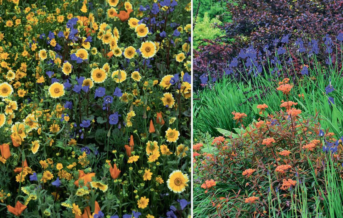
We select plants by color
Garden coloristics is an art based on patterns of color perception. Color schemes, that is, schemes of landscape compositions based on the selection of plants by the color of flowers and leaves, can be both contrasting and monochrome, fascinating with a wealth of nuances, as well as warm and cold, simple and complex, bright and muted, of dense, saturated colors and delicate, diluted, in pastel colors.
Within the framework of any accepted scheme, both successful and unsuccessful decisions happen. Moreover, with the acquisition of experience, the artist’s eye, which lives in the soul of every gardener, becomes more and more vigilant and demanding from year to year. And in what previously seemed acceptable, over time you begin to see flaws. Gradually comes the understanding that it is necessary to take into account the compatibility of plants in the tone of not only flowers, but also foliage, which in some cases “kills” a lovely flower blooming nearby, and in others — presents it in the most advantageous light.
Monochrome or multicolor?
In many ways, the choice of color is really a matter of taste. And temperament, age, childhood memories, family and cultural traditions, national flavor, fashion leave their imprint on him. Many of us have our own hot passions, including our favorite color, which we want to see in any combination in the interior of the house, in clothes and in the garden.
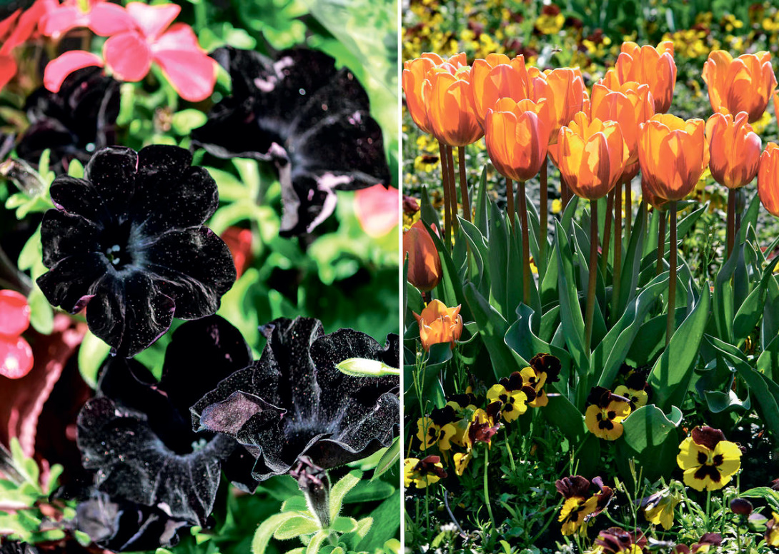
This is how monochrome landscape compositions are born. White garden, pink, blue, yellow-orange and even chocolate and black — choose what you like!
Tastes change and, tired of contemplating some cold white flowers, suddenly you want to surround yourself with warming and invigorating shades of warm colors, or even mix all the colors from flower tubes and scatter them thickly throughout the garden. This approach is typical for rural-type gardens in a variety of ethnic variants.
Somewhere in the middle is an option that will suit lovers of both monotony and multi—color: divide the space of the country lands into segments and distribute your favorite colors so that each of the plots has its own monochrome garden.
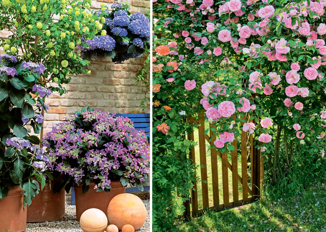
This approach makes it easier to achieve harmony in color in your “environment”, since the search for harmony is conducted between whole groups of plants, and not between individual curtains and bushes. Immediately decide which color combinations are most harmonious for you in contrast, and arrange the plantings in accordance with the accepted scheme. For example, a blue garden will border on white, white on yellow, yellow on red or purple. Within each monochrome mini-garden, harmony is born from a more “subtle matter” — nuances, that is, shades of the main color, differing in saturation and purity of colors.
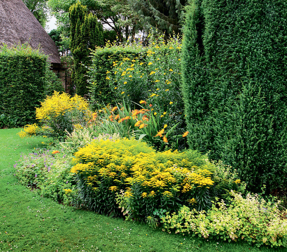
But don’t take the term “monochrome” too literally. So, within the boundaries of the blue garden, a whole range of closely related tones is possible — from blue to purple, dark and light, and not only in flowers, but also in foliage, for example, silver-blue and bluish-green. A yellow garden can also include orange and lemon tones.
For subtle connoisseurs of style, there are rich opportunities to emphasize certain elements of architecture with the tone of a monochrome landscape composition, for example, the color of the facade or roof of a house, white platbands. These elements remain unchanged, unlike flowering plants. Therefore, if you have determined for yourself that the color of the blue gazebo will become brighter and more elegant, if, for example, an optimistic red nasturtium blooms on its background, then why not stick to the chosen color contrast from spring to autumn?
In spring, the orange parade will be opened by the lights of the garden gravilat, and in autumn the orange Crocosmia, Dahlia, Rudbéckia will close the season.
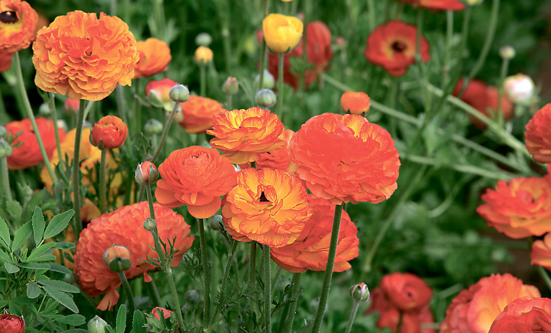
How strictly the accepted scheme should be followed also depends on your preferences. On the one hand, adherence to order will help to avoid challenging, unsuccessful combinations, on the other — a series of monochrome compositions can only be accepted as the basis for a more complex color scheme with the inclusion of seasonal accents from contrasting color inclusions.
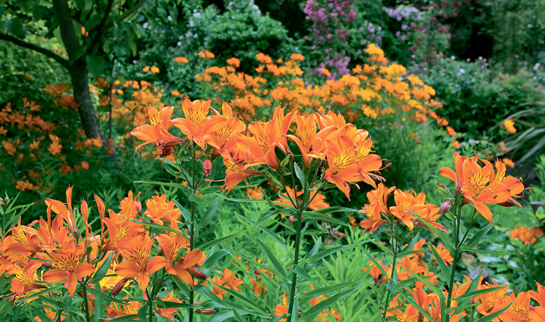
According to experts, in childhood we like “open” pure bright colors and simple contrasts, and with age we begin to appreciate more complex, mixed colors and color nuances. The colors of chemical markers quickly tire, but they, diluted with white or darkened with gray or black paint, suddenly seem more natural and pleasant.
At the same time, there are enough of those who retain the spontaneity of a child’s gaze for the rest of their lives and sincerely rejoice in the multicolored juicy colorful compositions, without being embarrassed by the dissonances that sometimes arise. After all, they are also on the flower meadow!
It is important to understand: although the laws of coloristics in painting and landscape design are the same, the tasks set by the artist and the gardener are still different. For an artist, it is often important to excite the viewer, expose problems and make us emotionally experience them. Therefore, the artist’s goal is not always to achieve harmony. At the same time, hardly anyone will agree to create a landscape for themselves that will constantly excite, remind of the imperfection of the world. In the garden we strive for harmony, that’s why we create an oasis in which everything breathes joy, and the play of colors only delights the eye and satisfies the natural need for diversity.
